It is this playful type of interaction that will push creativity further, distill immense amounts of data into creative production. In this research, we will use one of AI algorithms, namely VQGAN+CLIP, to generate streetscape imagery of the neighborhoods of New York City; to both see whether it could create portrayals of these micro-urban areas accurately, and if these images could be used to better understand the current status of these neighborhoods.
What is VQGAN+CLIP?
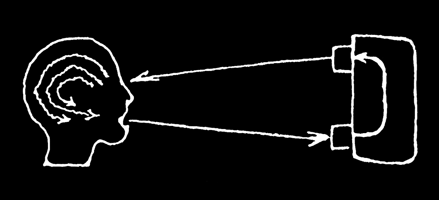
VQGAN and CLIP are two separate machine learning algorithms that are used in tandem to generate images based on a text prompt. VQGAN is a generative adversarial neural network that is good at generating images that look similar to others (but not from a prompt), and CLIP is another neural network that is able to determine how well a caption (or prompt) matches an image.
How does it work?
When the two algorithms combined to work together, it works as a prompt-based image generator that creates results that are surprising, unexpected and undiscovered. For all sorts of creative practices from motion picture to architecture, this “unknown” aspect of the end product holds a unique potential as an ever-dialectic creation tool that constantly feeds the creator with new unexpected.
However, despite the potential VQGAN+CLIP has for creative purposes, could it also be used as a research tool that provides quantifiable data? In this blog post, we will explore the potential of the two algorithms being used as a research tool that could later be utilized to understand and alleviate urban problems of different neighborhoods.
Hallucinating Streetscapes
This project uses VQGAN+CLIP to generate street imagery of the neighborhoods of New York City. Main objective was to see whether the algorithm was able to generate architecturally-accurate image representations of distinct parts of the City from given text prompts.
As VQGAN+CLIP is a rather general purpose algorithm, generated images lack a certain clarity and composition found in urban photography. However, the algorithm successfully brought together distinct architectural and urban elements, such as color, material, styles, and urban artifacts. The results captured what could be argued as the average look—or the urban fabric of these places—and distilled them into a collage of averages.
The resulting images contain buildings and architectural elements that carry distinct character and styles; urban features such as sidewalks, streets, signs and vegetation; and certain human figures that populate them.
Finding the best question to ask to the machine: Prompt-engineering
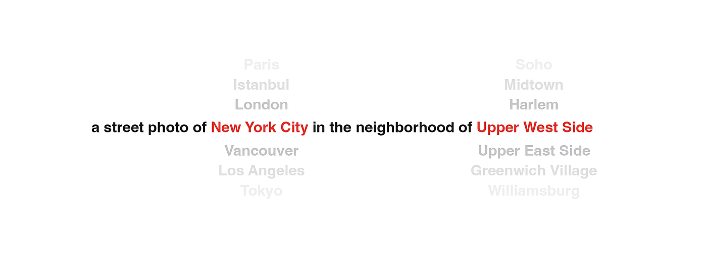
As VQGAN+CLIP is a prompt-to-image algorithm, finding out the best-performing prompt was crucial to start with. Among various alternatives, the syntax below produced the best results.


Upon deciding on the syntax, we started experimenting with three neighborhoods of New York City that have highly distinct architectural features to them:
Upper West Side, Wall Street, and Harlem.
VQGAN+CLIP generated images that accurately portray the ‘gist’ of these three distinct neighborhoods.
Upper West Side, a neighborhood that’s known to be home for some of Manhattan’s most expensive real estate, is a high-income residential area with buildings in varying sizes, brownstones distinct to New York City, as well as restaurants, shops, and parks.
Similarly, images produced for
Wall Street also successfully captured the look of the area. Gone are the Upper West Side’s stone-clad facades, these images portray the realities of Manhattan’s famous office towers with grand lobby entrances and an abundance of windows rising above.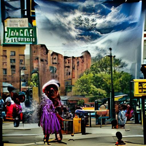
Lastly,
Harlem, a neighborhood that historically has been a home to many African-American Communities in the city, and is still one of the most prominent epicenters of the Black culture. Images produced for Harlem also accurately replicate the urban fabric — low-to-mid-rise residential blocks leaving a larger room in the frame for the sky, urban artifacts such as street lamps, signs, urban furniture crowding the streets, and a noticeably higher proportion of black figures populating the street level.Widening the scope: Other neighborhoods, boroughs, landmarks, and locations
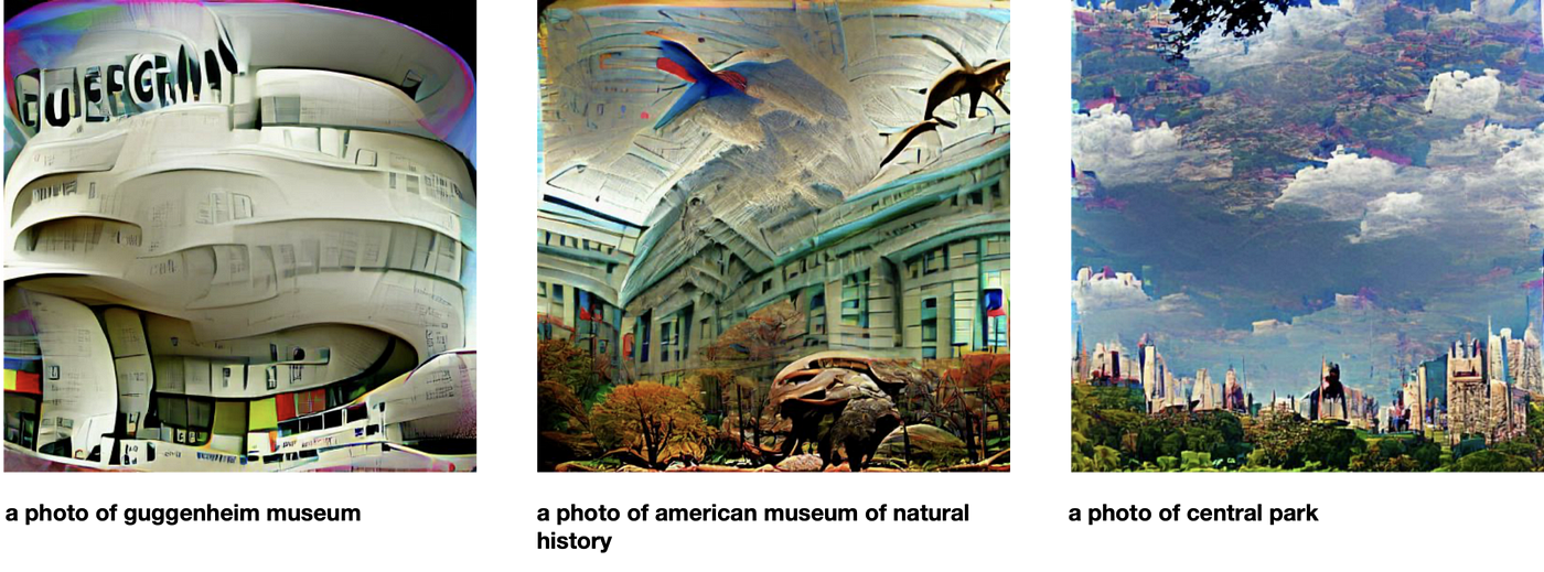
As the first trials offered promising results, we tried various other locations in the City. Among these locations are neighborhoods, landmarks, institutions, infrastructure, street names and parks; all generated through using the same syntax, resolution, seed and iteration count.
 Images generated for Midtown-Times Square area, even though the prompt did not inclide Times Square, have similar results. 42nd Street, where Times Square and Times Square Subway Station is located, is as densely populated as Times Square. Broadway, a name heavily associated with theaters and Times Square, also resulted in similar urban settings: Dense streets, street signs and populated ground levels.
 Images generated for well-known, distinct neighborhoods have resulted in accurate images. Chinatown and Soho are some of the two that are highly accurately captured of these.
Can the AI tell the difference between a well-off neighborhood than the one that’s not?
Up until this point, VQGAN+CLIP has generated outputs that have achieved to capture the average feeling of prompted neighborhoods. If we assume that the algorithm is fairly successful at generating
an average façade , what would these façades tell if we use the algorithm to generate ones for neighborhoods with varying socio-economical factors. Simply put, could the AI tell the difference between a well-off neighborhood than the one that’s not?
Images above point out to a stark contrast between high-income neighborhoods such as Greenwich Village or Upper East Side and relatively lower-income areas such as the Bronx, which is not a neighborhood but a borough that has the lowest annual median average household income as the 2019 US Census Data shows.
Images generated for the former also do have a well-off architectural representation —tree-covered streets, buildings with wider windows and cleaner facades, people in ‘fancy’ clothes walking down the street. Whereas the images generated for the former usually contain not very-well organized streetscapes, dirtier facades with windows seemingly randomly sprinkled throughout, broken wire fences in front of blind-facades.
Below are some further results, showing differences between two neighborhoods on the opposite sides of annual median average household income scale, Upper East Side and Harlem.

Images generated for Upper East Side feature neoclassical architectural elements that can be found in the famous townhouses and historical residential buildings in the area, and the results are persistent throughout various prompts: Once again, tree-covered streets, buildings with wider windows and cleaner facades, people in ‘fancy’ clothes walking down the street.

Images generated through various Harlem prompts do also have similar features — smaller windows, dirtier facades, fences, street signs, cramped streets…
In general, it is safe to say that AI-generated ‘average facades’ for these lower-income neighborhoods tend to feature a relatively more neglected-looking urban environment compared to their better-off counterparts.
What does the AI know about your street? Or the neighborhood park? Or the highway near the river?
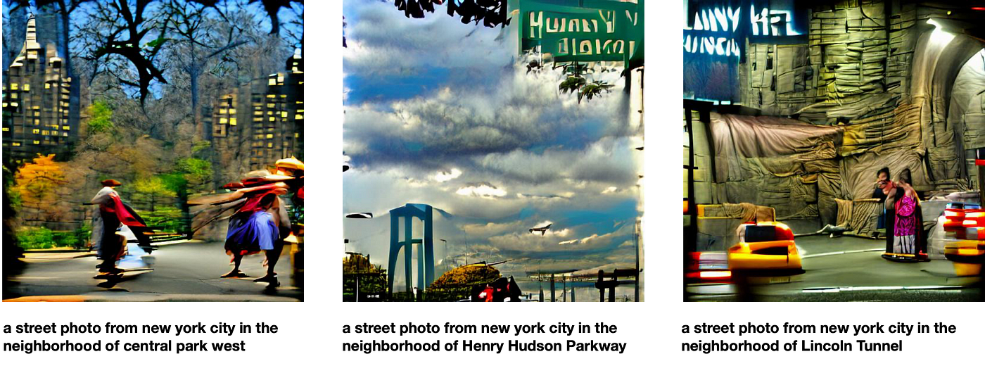
The algorithm successfully generated images for well-known streets and infrastructure such as Central Park West, Henry Hudson Parkway and Lincoln Tunnel. The first image contains the street of Central Park West, with a park and New York-style high rises in the back. The second image features a highway sign on top, a bridge rising among trees, and a river in far distance; similar to what you could see when approaching George Washington Bridge on the Hudson River.
The algorithm also was surprisingly accurate when producing less popular neighborhoods and parks. Images generated for Morningside Heights, a residential neighborhood in Upper Manhattan, has architectural elements that remain consistent even when the prompt is changed to the names of the parks that surround the area. Notice how the first two images above have buildings that are similar to the third one.

Lastly, urban parts that are visited in less frequency for lesser amount of times have also resulted in relatively accurate imagery. Above we see an image towards Midtown from one end of Lincoln Tunnel, the other a photo from the apron of JFK.

How well informed VQGAN+CLIP of institutions that have a prominent urban presence?

A surprising output was when using abbreviations. As seen above, the prompt “New York University” has resulted in an image that contains architecture that resembles Greenwich Village, where NYU is located, as well as banners in the color of the university. When the prompt was changed to “NYU,” the images did not contain anything related to the institution.
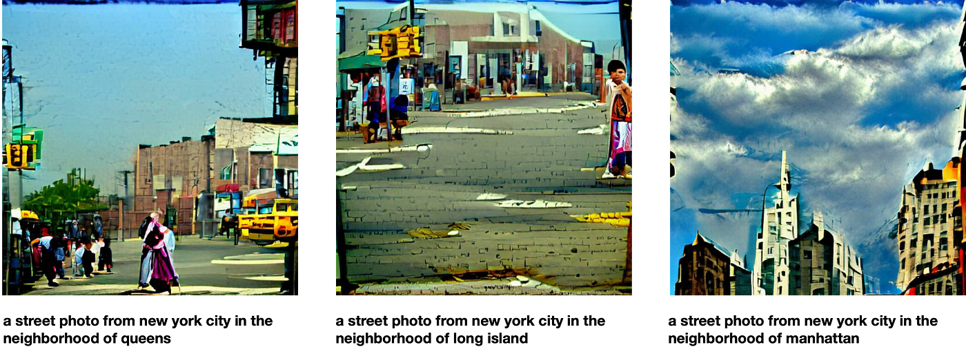
The rivalry between Manhattan and Brooklyn has been a hot topic for decades now. Yet when it comes to generating images, VQGAN+CLIP seems to have a certain preference of one over the other. Images generated for Manhattan, presumably due to being the more ‘documented’ one, tend to contain relatively more accurate and recognizable features.

Although many different prompts that are related to the same urban area produce similar results, VQGAN+CLIP does not always generate similar representations in different iterations. As seen below, two images generated for Wall Street are distinctly different. Although, it shall not be overseen that both images are accurate representations for the area — they are simply different outtakes from the same part of the city.

The former depicts a streetscape with (what it seems like) a grand lobby entrance at the back, populating the crosswalks with people in black coats in the front. The latter is a fairly accurate urban depiction of (presumably) the New York Stock Exchange, which is one of the most photographed and well-known buildings of Wall Street.
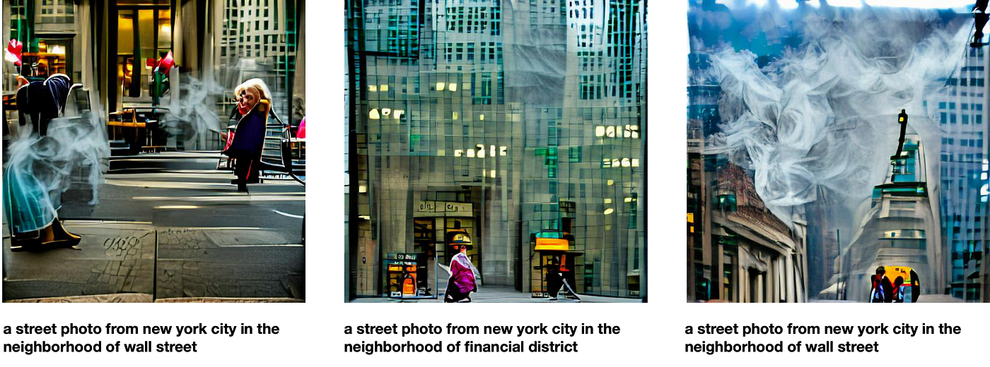 Adding one more to the mix, the algorithm also generates similar images for a different prompt. Today, Financial District and Wall Street are pretty much used synonymously when referring to roughly the same part of the city — a very dense, small urban piece of land in Lower Manhattan. Hence, the result contains similar features — tall office buildings rising above to the sky.
Read the full blog post on Medium here.
Fu Foundation School of Engineering and Applied Science